Keen:Planet Modding/Compass
Compass modding introduction
It is possible to mod visual look of an in-game compass. All definitions of compass are stored in Content\Data\GUI\CompassDefinition.sbc. Our textures for compass are in Content\Textures\GUI\Compass folder if you want to check out how they look or use them in your mod.
Creating compass texture atlas and setting coordinates for its elements
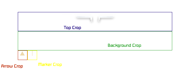
Just like with map sprites, we save main compass elements on a single texture, then define parts of it using pixel coordinates. First setup origin point, then add width and height of the rectangle
Example texture coordinates for top part of the compass:

<TopCrop X="0" Y="0" Width="512" Height="32"/>
Explanation of compass definitions line by line
<Texture>Textures/GUI/Compass/compass.png</Texture>
Path to a texture atlas.
<KingdomIcon>Textures/GUI/Compass/Icon-Kingdom.png</KingdomIcon>
Path to icon symbolizing a kingdom.
<Padding>7</Padding>
Padding is added vertically between the top and bottom textures and the edges of the contents of the compass.
<TopCrop X="0" Y="0" Width="512" Height="32"/>
Rectangle in the texture that contains the top part.
<BottomCrop X="0" Y="0" Width="0" Height="0"/>
Rectangle in the texture that contains the bottom part.
<BackgroundCrop X="0" Y="64" Width="512" Height="64"/>
Rectangle in the texture that contains the background.
<ArrowCrop X="0" Y="128" Width="32" Height="32"/>
Rectangle in the texture that contains the little marker used for elements that are drawn and have no icon.
<MarkerCrop X="32" Y="128" Width="32" Height="32"/>
Rectangle in the texture that contains the interval bars drawn every few degrees.
<ShadowCrop X="64" Y="128" Width="80" Height="32" Left="8" Right="8"/>
<ShadowPadding Left="12" Top="8" Right="12" Bottom="8"/>
Rectangle in the texture that contains the text shadows. Shadow is 3-Sliced, meaning the texture is split in three parts: [left|middle|right] The sizes of left and right define the cropping lines that split the texture into three. The Sides are then always kep proportional as the texture is scaled.
<VisibleRange>200</VisibleRange>
Visible range in degrees.
<Width>700</Width>
Width in reference resolution pixels.
<FontSize>1.1</FontSize>
Scale of the font based on default.
<VerticalOffset>0.065</VerticalOffset>
Vertical offset from the top of the screen. 0 = top of the screen, 1 is the bottom. Compass is centered around this position.
<TagStyles>
<TagStyle Tag="ClaimArea" Style="Bellow" MaxCharacters="15" Ellipsis="true"/>
	<TagStyle Tag="Cardinal" Style="Above" MaxCharacters="1"/>
	<TagStyle Tag="Kingdom" Style="Bellow"/>
</TagStyles>
This section adds tags that are visible on compass and in which style. Currently we have 3 types of tags. Claim area - shows your claimed area on the compass, Kingdom tag shows kingdoms and Cardinal tag shows cardinal points (North, South,...). Each tag’s visual appearance is defined in tag/waypoint definition. Styles defines where should the text appear. Available styles: Center, IconOnly, NotShown, Bellow, Above.
Explanation of Waypoint/Tag definition
<Definition xsi:type="MyObjectBuilder_WaypointDefinition">
	<Id Type="MyObjectBuilder_WaypointDefinition" Subtype="Kingdom"/>
	<IconPath>Textures/GUI/Compass/IconKeep.png</IconPath>
	<Color R="255" G="255" B="255" A="255"/>
</Definition>
IconPath contains path to the texture of kingdom icon. Color defines color of the text that is shown with the icon. (Example: Fareon, ![]() )
)
Compass texture vs in-game look comparison
Texture:
In-game look:

*note that background crop and bottom crop are not used in vanilla (empty opaque texture)
