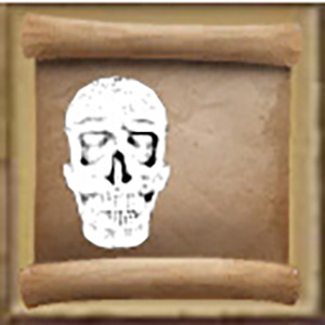
Keen:Schematic Icons
 OFFICIAL CONTENT OFFICIAL CONTENT |
| Version: | 0.4 |
This document Describes the workflow to create the style of our research icons.
Template Files
http://www.medievalengineerswiki.com/uploaded_files/Schematic_Template.zip
Make Screenshot
Take a screenshot of the desired asset.
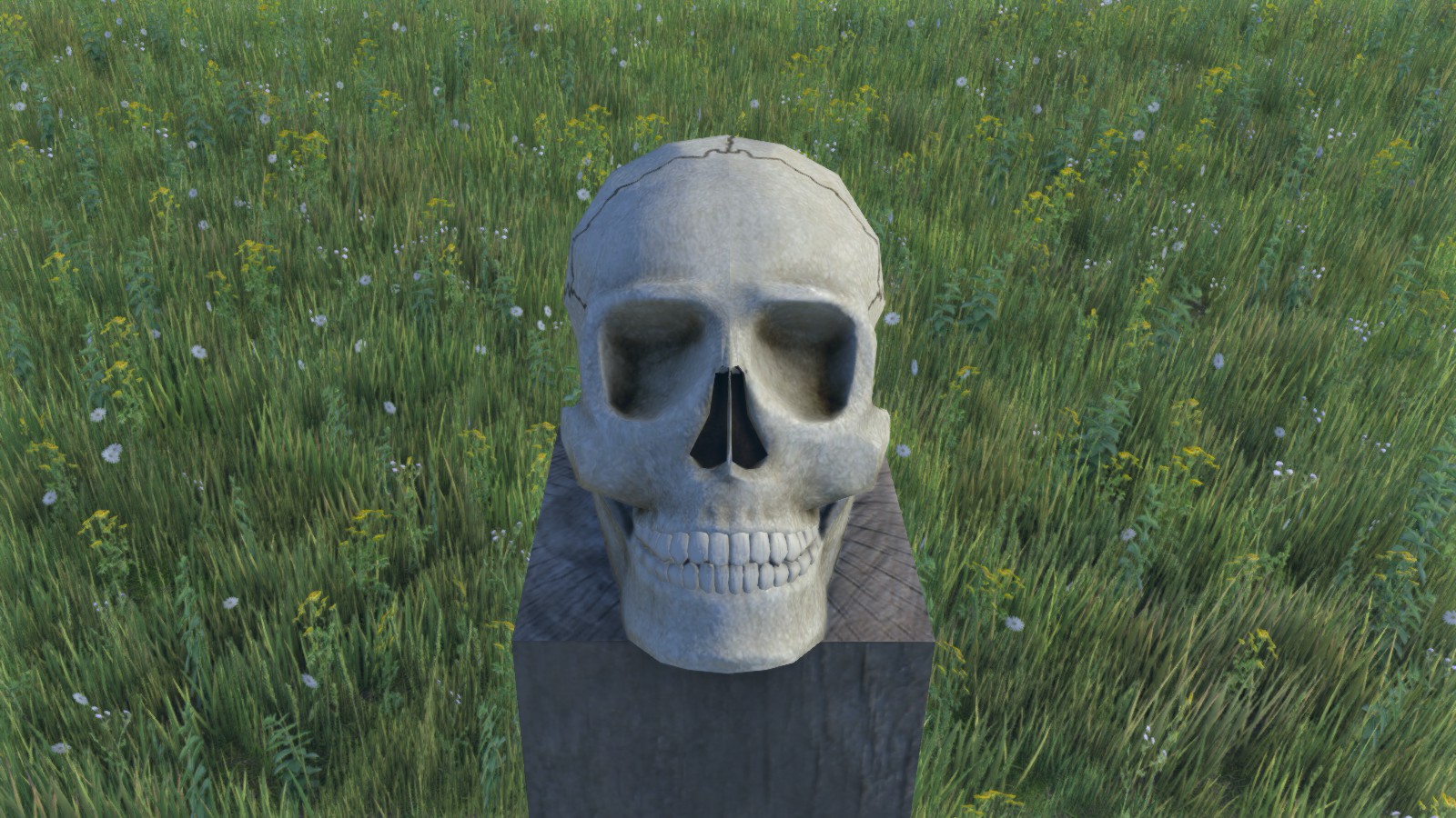
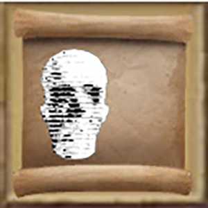
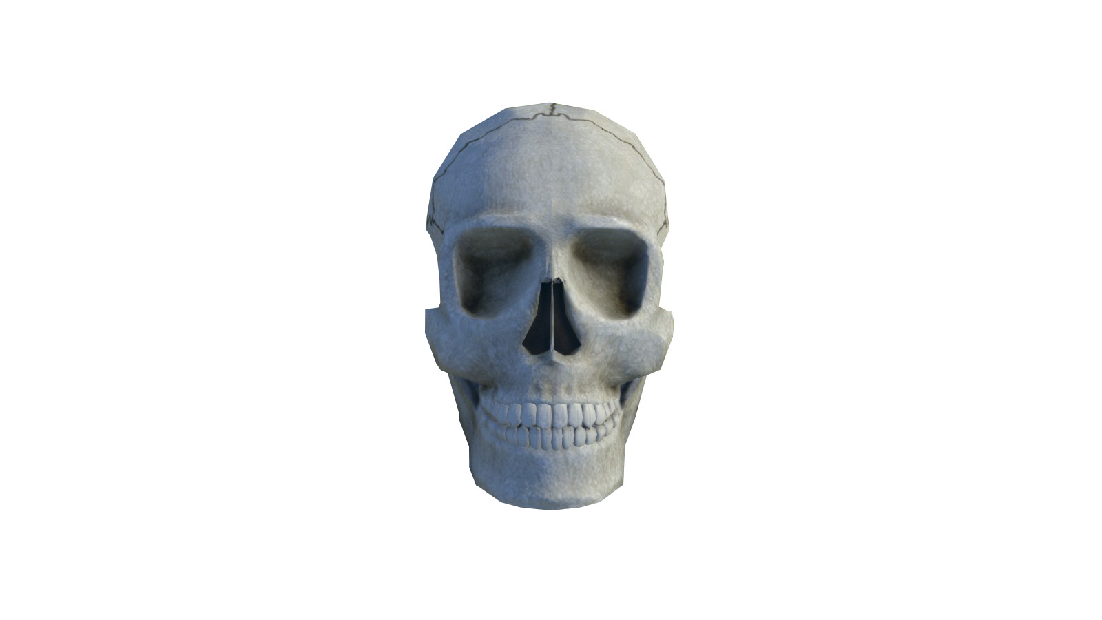
Cut out the asset (I used the polygonal lasso tool).
Also, if you take a screenshot of a block, you can be fancy about the cutout, to break the square shape. For instance, cut out along the stones, or fade out less important parts.
Photoshop
Open the Schematic icon template.
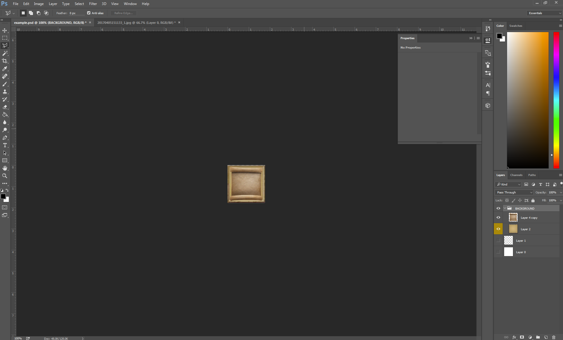
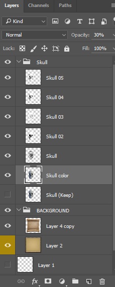
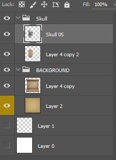
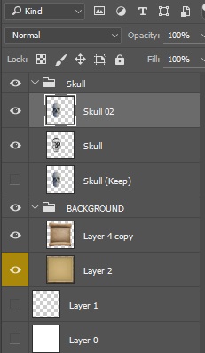
Copy the cutout asset layer, and paste it into the template file, then resize it appropriately (preferably, create a folder for the icon in the layer panel).
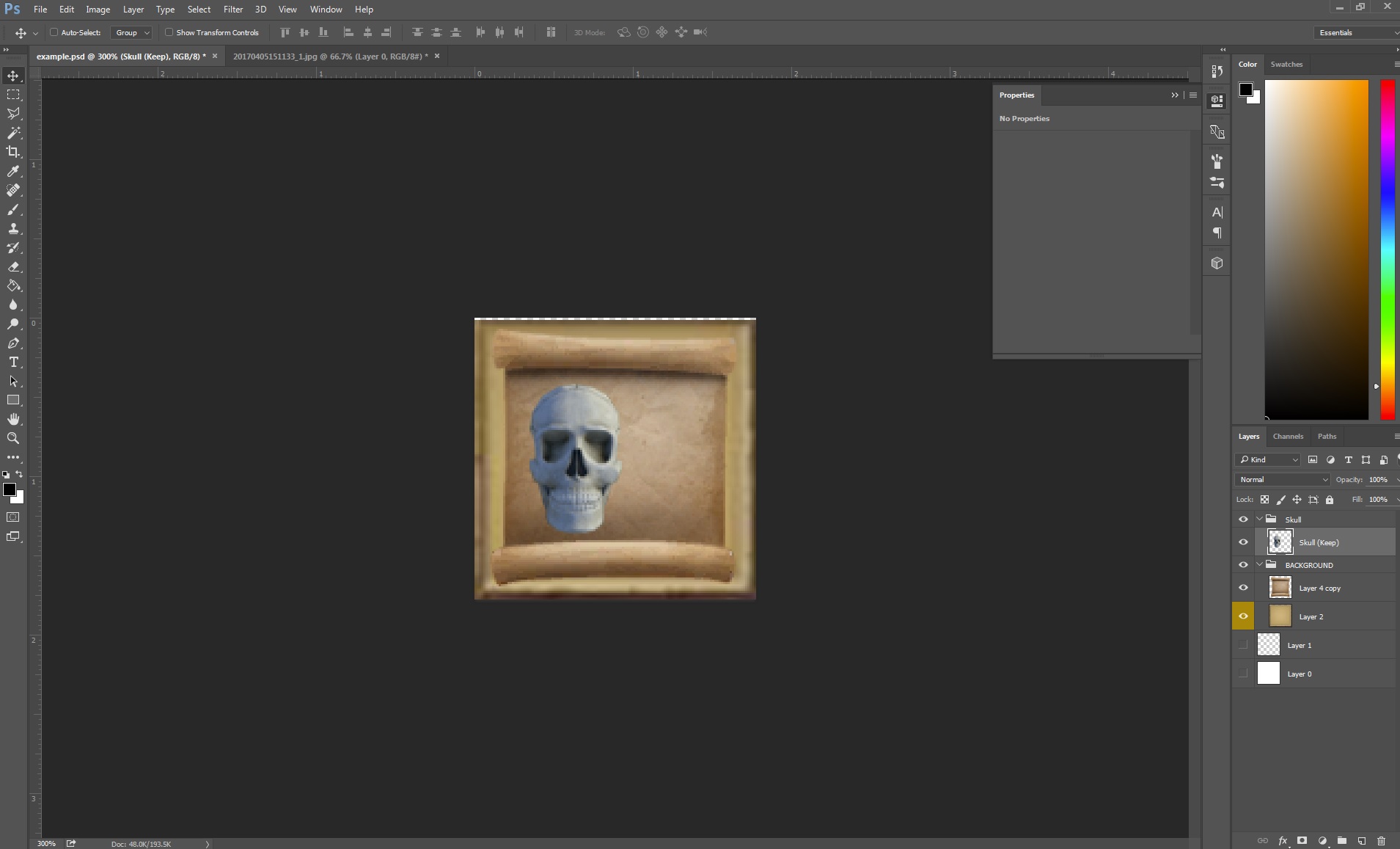
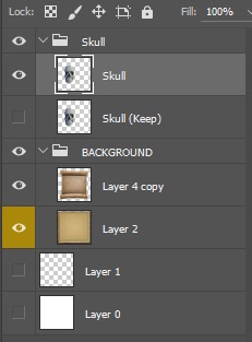
Duplicate your asset layer, but always keep an intact copy until the end of the process (hide this one).
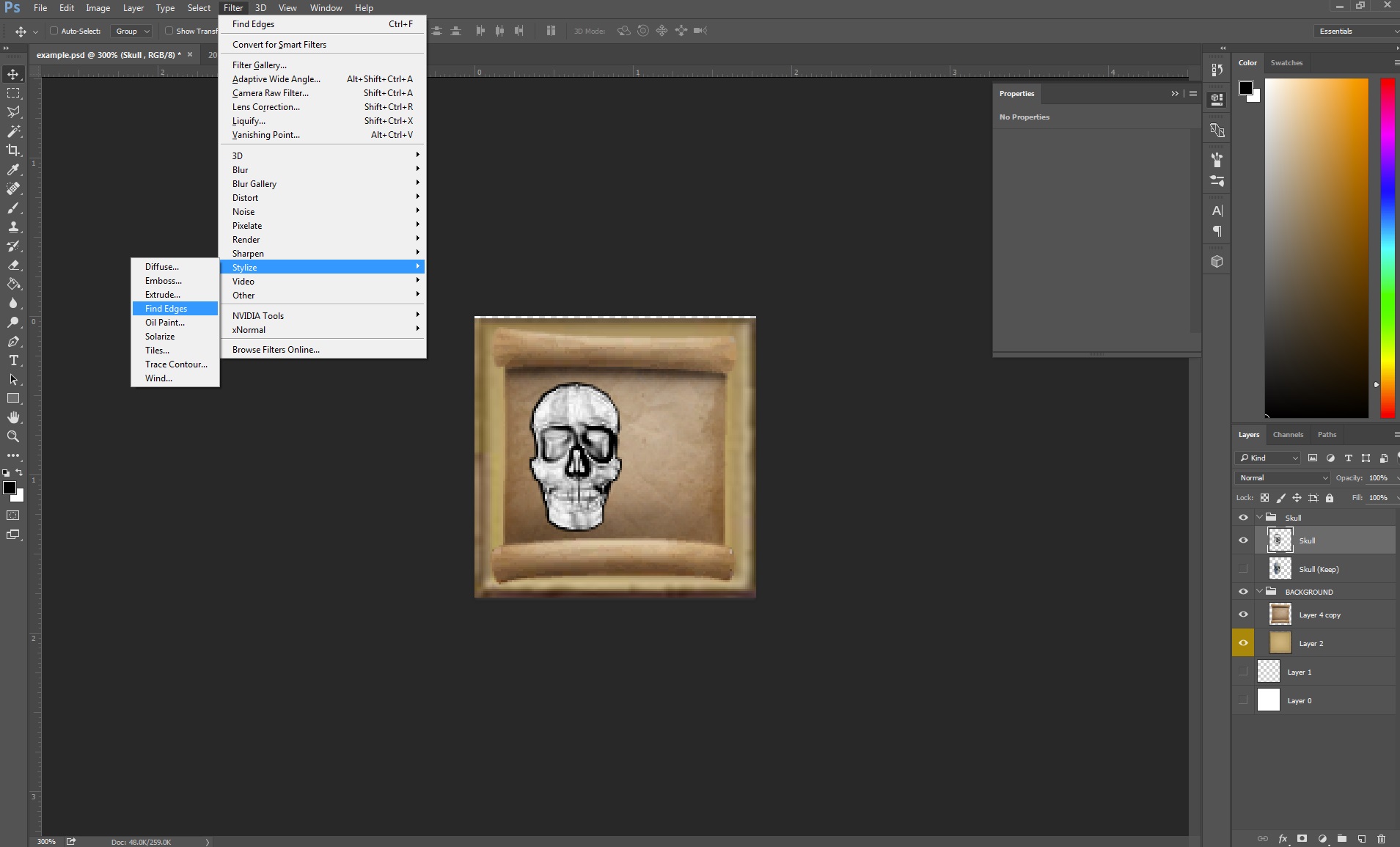
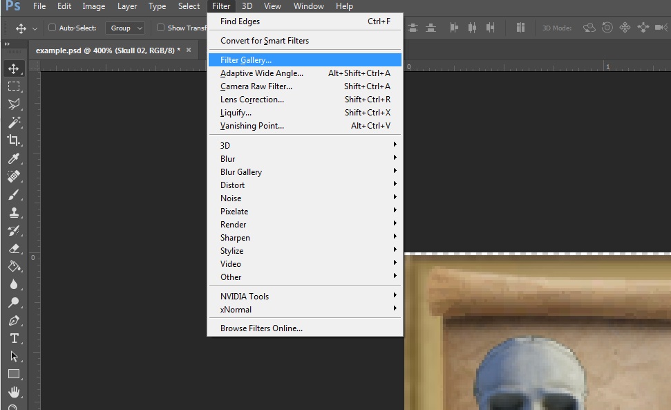
Select the copied layer, go to filter rollout > Stylize > Find Edges then desaturate the layer (Ctrl+Shift+U).
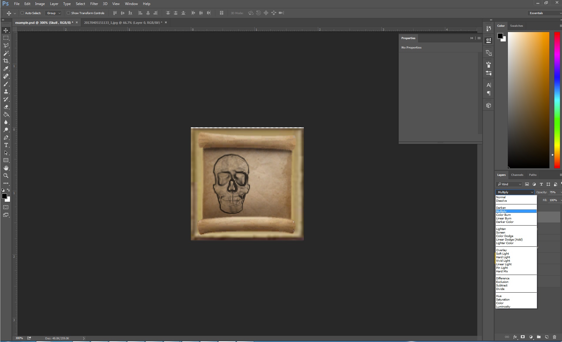
Put this layer in multiply mode and turn the opacity around 75%.
Duplicate the hidden layer, move it on top of the stack and make it visible.
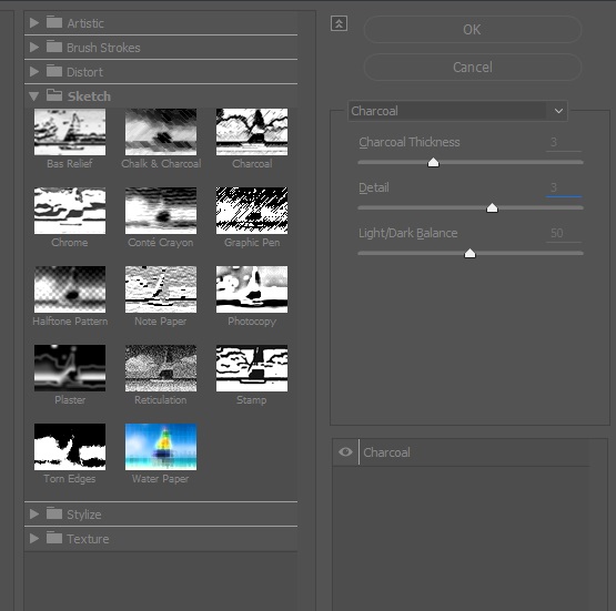
With this layer selected, go to Filter rollout menu > Filter Gallery…
Use the charcoal filter, and tweak as you feel looks best (try not to overload it with details, this process is going to be repeated several times, and each layer will add on top).
Set this layer also in multiply blending mode and around 75% opacity.

Duplicate the hidden layer again, make it visible, move it on top of the stack, go to Filter > Filter gallery, and apply Photocopy filter, then put this layer on Multiply blending mode and around 75% opacity.
Repeat the step 12, but apply a conté crayon filter instead.
Repeat this step one last time, with a graphic pen filter, but you will also apply a Filter > Blur > Gaussian blur at 0.4 pixels. This step is used to break the padding effect of the pixels.
Duplicate the hidden layer, make it visible, but leave it on the bottom of the stack. Put its opacity to about 20-30%, this is to give some pale color.
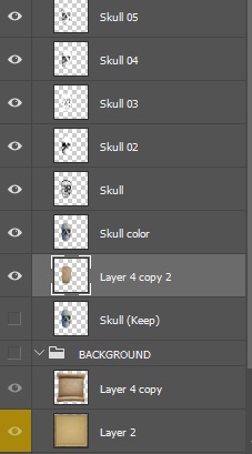
Copy the background paper layer, place it on the bottom of your icon folder layer stack.
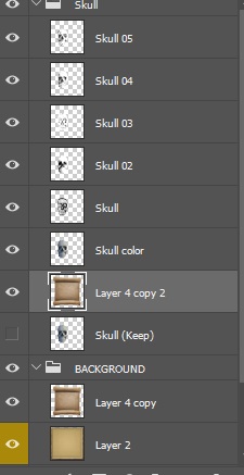
Ctrl+click on your hidden layer to make a selection out of its content. Then press Ctrl + Shift + I to invert the selection. Select the background copy, and press Delete.
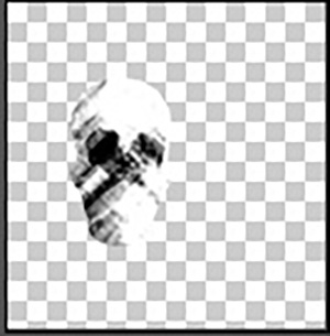
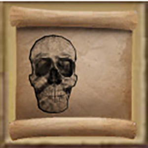
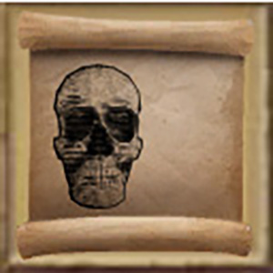
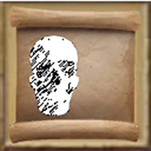
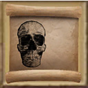
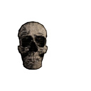
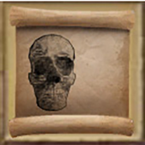
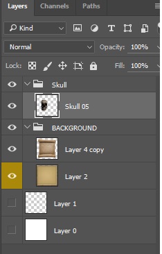
You should end up with something like this (duplicated background layer now has the shape of the asset). The background is invisible so that you see the paper texture only on the skull.
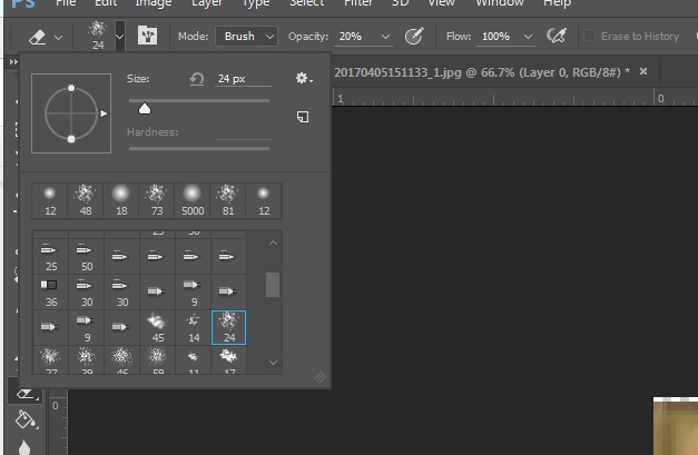
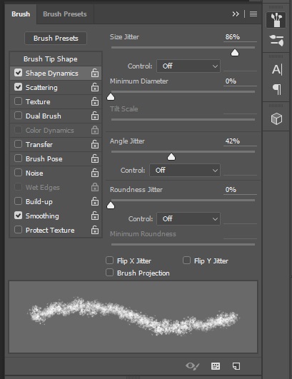
Optional You can merge all your asset layers except the copied paper background, and apply an irregular eraser tool with very low opacity, this will give an older look. Do it with slight, subtle strokes.
Now delete the original hidden layer, and merge all layers in your icon folder.
Optional You can add some text around the asset image, this gives a more authentic feel. Set it to 75% opacity. It does not matter what you type, it will not be readable at icon size and resolution. You can also apply the light eraser from step 17-optional to the text. In order to do that, create an empty layer under the text layer, and merge it with the text layer. The text layer will then become a standard layer that you can use the eraser on.
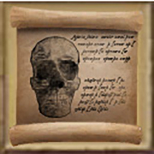
You now have a schematic icon :D
(do not forget to hide the background before saving the .DDS file)
